
Project Overview
Problem
Traveling with friends and family is one of the most frustrating and complicated process.
It’s a hassle trying to figure out where to stay, how to get to the location, the trip itinerary, splitting the bills, communicating with one another, and making sure everyone is on the same page.
I travel a lot with friends and these are the same problems we encounter.
There needs to be an easier and efficient method of planning a trip and sharing travel experience all in one app.
I wanted to explore how I can simplify group traveling.
-
Duration
July 2022 - August 2022
-
My Role
Product Designer
-
Tools
Figma
Jira
Zeplin
Google Optimize & Analytics
Fullstory
Understanding the Problem
Secondary Research


Competitive Analysis


Key takeaways from research
There needs to be an app that:
Has excellent UI/UX Design
Organizes travel necessities
Inspires for other travel locations
Collaborate to plan a trip
Allows for communication with travel group
Create and organize itinerary
Share photos
Store documents
Create/share notes
Understanding the User

Screen Survey
I created a survey to find potential users of the app. I sent it to friends and families through text. I reached out to people I didn’t know through social media such as Instagram, Twitter, and Facebook.

Interviews
Once I found the 5 potential users,
I interviewed them, took notes and created an affinity diagram.
Affinity Diagram

I started off by categorizing the information by the names of the users and their answers to the given questions.

Then I realized it was better to categorize them by the interview questions and putting similar answers under each question.

What I learned from the affinity map/interviews are:
Travelers’ process when planning a trip, what resources they use to plan a trip and what tools they're lacking
Travelers go on group travel because it is safer, cheaper, fun and being able to create long lasting memories
Travelers are frustrated with having to plan a trip with different personalities, interests, budgets and schedule
Travelers feel like planning a trip is very unorganized and inefficient
Social media plays a huge impact on their travel plans

Empathy Map
Based off the empathy map, I was able to identify the users' behavior. I learned that:
Users will feel safe traveling with friends but feel frustrated with having to use multiple resources to plan a trip
Frustrated with how unorganized it is to plan a trip with friends
Users will get an airbnb and split the cost
Users will create a group chat for everyone to communicate on
Users will hear people talk about wanting to go to different places but not taking the initiative to plan the trip
The gains of group traveling is that it is safer, cheaper, and being able to create memorable experiences with the people you love
The pains of group traveling is that planning a trip with clashing interests, preferences, budgets, schedules, miscommunication and disorganization
Personas

Aliyah is someone who: Loves to travel and share her experiences on social media Doesn't take the initiative to plan the trip since she is always busy with work Finds herself always paying for everyones bill on the trip and having to remind people to pay her back Wants a simpler way to split expenses with friends Wants the right group of friends that match her travel needs

Jalen is someone who: Loves to travel with friends but prefers to plan ahead so he can find the best deals and packages to save money Frustrated that he's the only one that takes the initiative to plan the trip Wants to minimize using too many resources to plan a trip Wants one tool that helps organize, collaborate, share and better communicate with one another
How might we….
Relieve the frustrations travelers have when having to plan a trip with different personalities, interests, budgets and schedules?
Help travelers find a new method of collaborating, organizing and sharing their trip on one app?
Help travelers better communicate with each other?
Help travelers be efficient with their time?

Empathy Map
Based off the empathy map, I was able to identify the users' behavior. I learned that:
Users will feel safe traveling with friends but feel frustrated with having to use multiple resources to plan a trip
Frustrated with how unorganized it is to plan a trip with friends
Users will get an airbnb and split the cost
Users will create a group chat for everyone to communicate on
Users will hear people talk about wanting to go to different places but not taking the initiative to plan the trip
The gains of group traveling is that it is safer, cheaper, and being able to create memorable experiences with the people you love
The pains of group traveling is that planning a trip with clashing interests, preferences, budgets, schedules, miscommunication and disorganization
Ideate
User Flow

Sketches


Moodboard
It's important to include real life images in the app to inspire and motivate the users to travel.
Optima font gives an informal, casual and fun look while exuding an elegance feeling. It is also easy to read. Optima family includes both regular and bold fonts which gives the freedom to be versatile with the information architecture.
The color blue is associated with the sky and the sea which is relevant to traveling. Blue also symbolizes serenity, relaxation and a sense of clarity which are important feelings that I want the app to portray.
Take advantage of skeuomorphism to give a more realistic and reliable look that the users are familiar with.
Style Guide

Prototype & Test
User Testing: Low Fidelity Prototype
I provided users with tasks and evaluate how effectively and efficiently users’ can find their information for their current trip.
Positive feedback:
users complete the tasks very easily and smoothly
organization of the information was common sense to the users
categorizing the information based on common and relevant words was very beneficial
Recommendations:
visually clarify that you can click or swipe on the “current, upcoming and past” trips as well as the “pay and request” on the expenses category
use words, terms, icons and images that the users are familiar with in order to build an intuitive experience
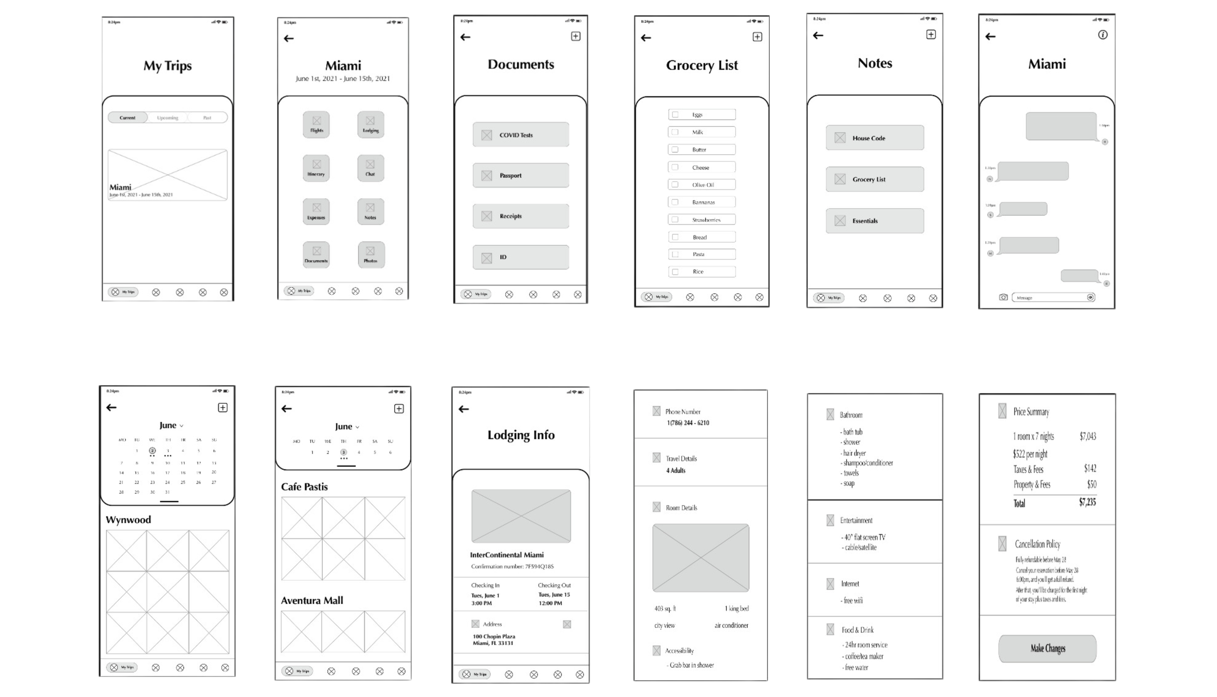
Style GuiHigh Fidelity Prototype #1

User Testing: High Fidelity Prototype #1
Positive feedback:
trip information was well organized and easy to find
icons were very helpful with maneuvering through the app
typography was easy to read
how the images were portrayed was creative for the photos section
Pain points:
the shadows on the buttons were too dark and aggressive
legibility issues with reading the categories on the buttons on the second page
stronger and more convincing color palette
High Fidelity Prototype #2

User Testing: High Fidelity Prototype #2
Positive feedback:
clean, simple and aesthetically pleasing
consistent elements of the colors, shadows, images, and shapes
straight forward, easy to understand with smooth interaction and experience
images were attractive to the eye and it made them want to travel more
icons were very helpful with maneuvering through the app
Pain points:
category buttons on the second page made the app look outdated and gave off like an android feeling
remove inner shadows on the buttons
“back” and “add” buttons on the header are hard to see
Clickable Prototype
What I learned
This was one of the most rewarding project I have worked on because not only am I passionate about traveling but this was the first time I designed an app throughly with a complete design process. It was great being hands on, putting myself out there, talking to users and having a comprehensive understanding of their experiences and problems. I had overcome being in uncomfortable situations when I had to teach myself how to use tools like Sketch, Invision and Miro.
Next Steps:
One last user testing on the current trip part of the app
Start on the other features of the app such as the explore, plan a trip, and social media
